Fall Watercolors

Fall Colors Blog 9

Hi Everyone,

It’s that time of year again!  The weather’s getting cooler, the days are getting shorter and little ones are back into the school routine.  Along with the big comfy sweaters, there are a number of beautiful changes that happen at this time of year.   One of my personal favorite changes are all the amazing colors that we see out there in nature.

Fall Colors Blog 1For this card, I wanted to use a really neat technique that I recently learned about that uses watercolor and regular old salt!  I am always fascinated by the chemistry behind some of the products we use and love using everyday items to stretch the effects you can get with them.  This technique is really easy and can come up with some really amazing results when you experiment and play around with it.  How it works is pretty simple.  As the watercolor dries, the salt displaces the pigment of the watercolor giving it an interesting texture.  Different salts, various amounts of water and using different paints will create a variety of results, making this a great technique to play and experiment with.

Fall Colors Blog 3Before starting my background I wanted to prep my salt.  I really want the image to have a shimmery quality so I decided to add Ranger Perfect Pearl to the salt that I would be using.  This means that as the salt does its magic and pushes the pigment of the watercolor away, the shimmer quality of the perfect pearls will line or fill the space left behind.  To prepare my salt mixture I simply placed some salt and a wee bit of the Perfect Pearl in a container, put the lid on and shook it up.

Fall Colors Blog 2I started my background with a piece of watercolor paper, trimmed to 3.75 x 5.25 inches.  Since this technique seems to work best with a very wet surface, I sprayed the piece with water before adding the watercolor paint.  While painting the background on using my Artists Loft Pearlescent Watercolors, I made sure to keep the paintbrush full of water when picking up the paints.  I also find it very helpful to spray the paint palette directly with water to make sure it too is wet.  Lots of water means a great reaction with the salt!

Fall Colors Blog 4Once painted with my desired shades, I took my salt and pearl mixture and sprinkled it on.  There really is not right or wrong amount to use when doing this technique, it really is whatever you are going for.  There really isn’t a right or wrong salt that you should use either.  There are so many different effects you can achieve if you play with the technique but I personally favor moderate amounts of table salt- and love to add the pearls.

Fall Colors Blog 5At this point, the best thing to do with your  image is to let it air dry.  I have attempted to heat it with my heat tool to dry it faster, but I find the results aren’t as drastic when I do that.  Once your image is dry, it’s time to remove the remaining salt.  This is pretty easy- simply brush the excess away.  I like to gently brush a straight edge over the image such as a plastic ruler or the side of an acrylic stamp block.  This just helps make sure the background is smooth to the touch.  Once your image is sodium free you’re ready to build your card.

I attached my image onto a note card that I made using Bazzill cardstock and added the piece of American Crafts Primio Ribbon.  For a little flair I attached some rhinestone stickers.  To glue down the Recollections leaves I used Ranger Matte Multi Medium, an awesome strong adhesive, and stuck down the acorn sticker on top while the glue was still a little wet.  Last step was to add the sentiment which was chosen from the Lawn Fawn “Let’s Play” stamp set, which I stamped down using Gathered Twigs Distress Ink.

Fall Colors Blog 7


Materials Used:

  • Canson Watercolor Paper
  • Artists Loft Pearlescent Watercolor Set
  • Ranger Perfect Pearls- Mandarin
  • Table Salt
  • Recollections Floral Embellishments
  • Bazzill Cardstock
  • American Crafts Primio Ribbon
  • Forever in Time Gem Swirls
  • Ranger Matte Multi Medium
  • Lawn Fawn Stamp Set- Let’s Play
  • Ranger Distress Ink- Gathered Twigs
  • Racollections Acorn Embellishment Sticker
  • Double Sided Tape

Pretty Pink Flowers

Pink and Green Flower Blog 1

Hello!

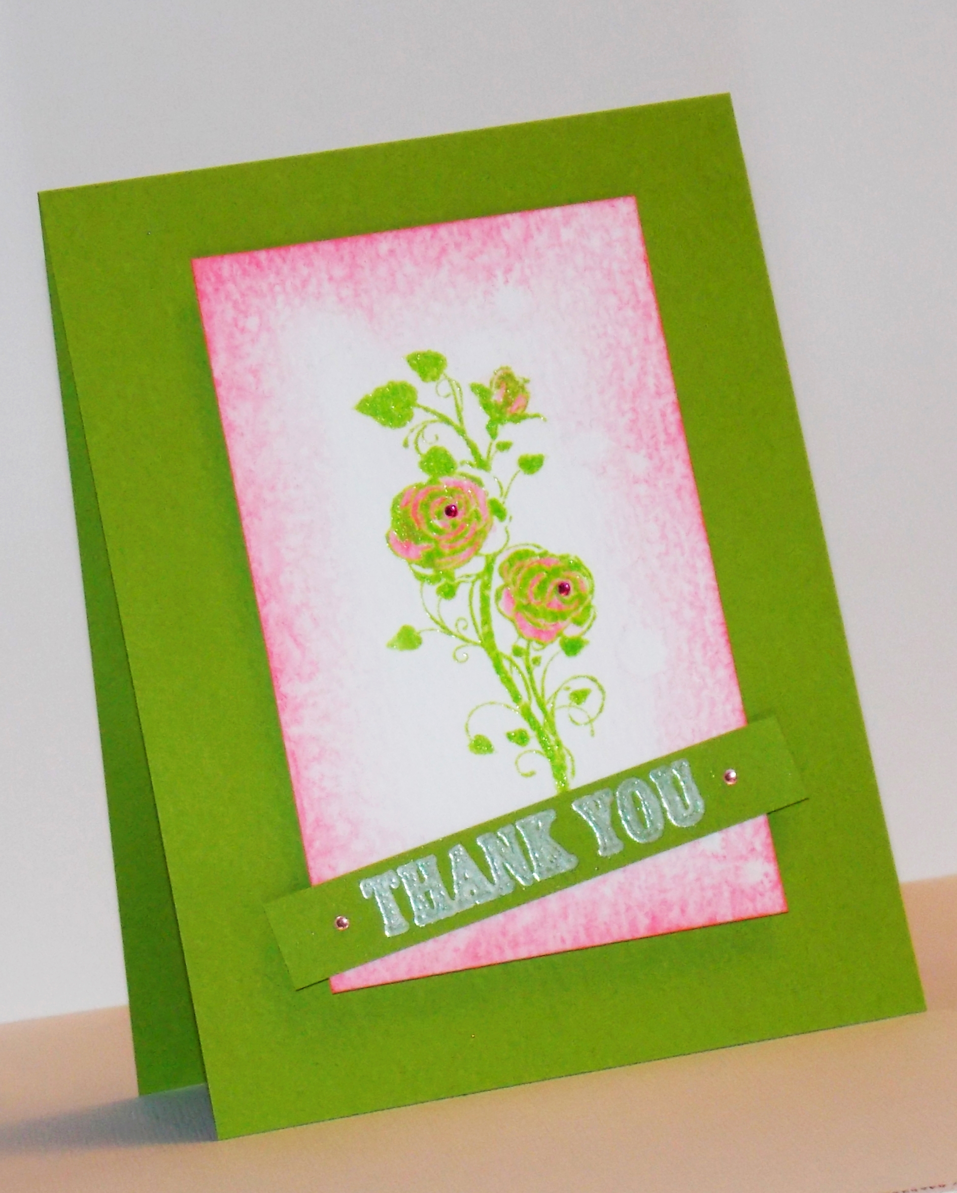
So I was looking to make a nice thank you card for a friend and wanted to put together something simple and pretty.  I love a good pink and green color combination so I decided that was where I am going to start.  I chose a pretty stamp that was a gift included in Cardmaking and Papercraft Magazine (Issue 142) and the shades of color I wanted and got to work.

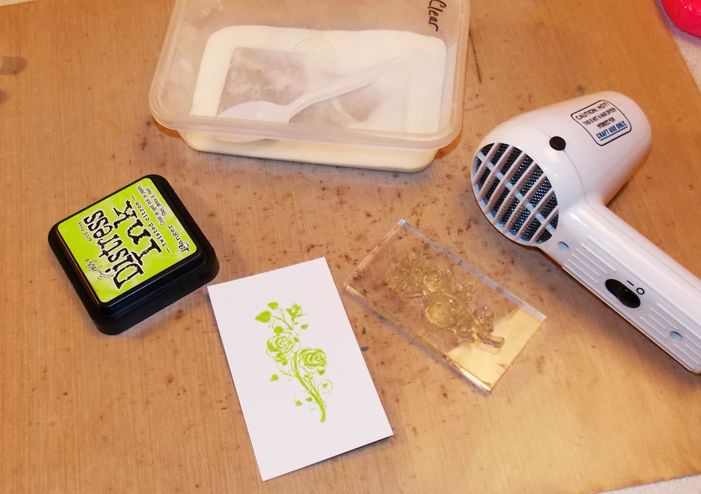
Pink and Green Flower Blog 4I started by stamping the image with Ranger Distress Ink Twisted Citron onto a piece of Ranger watercolor paper.  I really love the Ranger brand of watercolor paper as it’s a very clean shade of white.  There are some great watercolor papers out there, and I do have a good collection, but I love just how white the Ranger watercolor paper is.  As the image was still wet, I sprinkled on some clear embossing powder and heat set it.

Pink and Green Flower Blog 5Next I pulled out my Worn Lipstick Distress Ink and marker.  Using the marker I highlighted the roses in the stamped image.  I then sprayed the pink areas with a light misting of water to soften the pink and give it a bit more of a watercolor look. Be careful of this though, as the ink under the embossing powder is going to bleed a bit.  If you are looking for a crisp image. this is definitely a step to skip.  After blotting up the excess and letting it dry for a little bit I used a blending tool and added the pink border around the image.  I did this using a circular motion from the outside in using light amounts of ink and pressure,  repeating the process until I had the shading I liked.

Pink and Green Flower Blog 6I then took a spritzer of water and sprayed my hand to flick some water onto the image.  This was to give it that slightly worn and distressed look.  I blotted up the excess again before the ink could wick too much and gave the image a quick blast with the heat tool, being careful not to re-melt the embossing powder.

Pink and Green Flower Blog 7

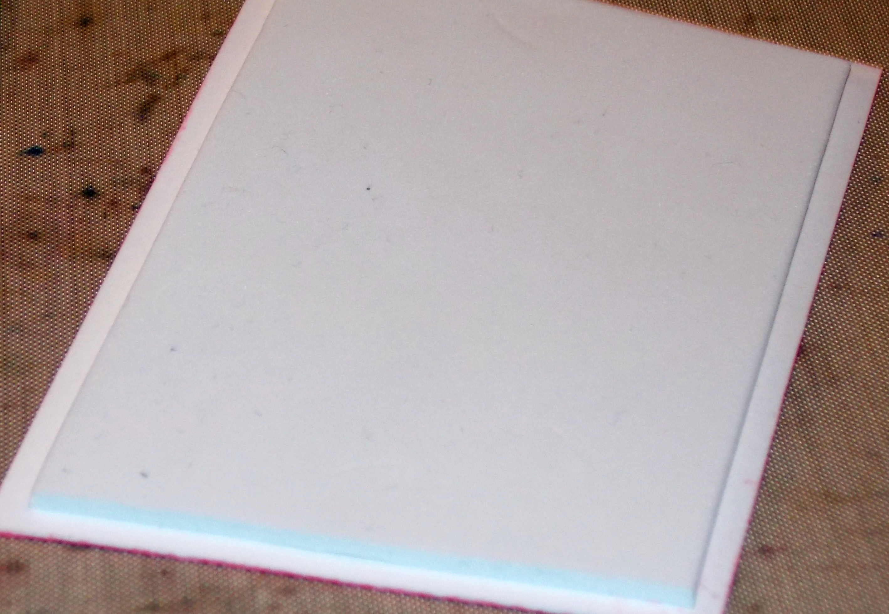
Ready to start building my card, I created a card base using Bazzill Cardstock.  I trimmed my card to 5.5 inch by 4.25 inch.  Using a piece of craft foam for dimension I attached the image to the green note card.  For this card I used the craft foam that has adhesive on one side which makes it very quick and easy to use.  For the un-sticky side, I simply used my trusty double sided tape.

Pink and Green Flower Blog 3To add the sentiment, I used a strip of scrap cardstock from making my notecard and stamped the “Thank You” sentiment using white Hero Arts pigment ink. I then embossed the sentiment using Wow White Pearl embossing powder.  After trimming the strip I added it to the card using double sided tape and a couple pieces of craft foam on the ends so that the ends would not bend over.  To finish the card off, I used a couple of Recollections Adhesive Rhinestones on the sentiment and to the center of the roses and voila!  Pretty card to go to a very wonderful friend.

Pink and Green Flower Blog 8


Materials Used:

  • Ranger Watercolor Paper
  • Bazzill Cardstock
  • Ranger Distress Ink- Worn Lipstick and Twisted Citron
  • Ranger Distress Marker-Worn Lipstick
  • Hero Arts Hero Hues Pigment Ink-Unicorn
  • Fiskars So Much Thanks stamp set
  • Cardmaking and Papercraft Magazine bumper gift roses stamp (Issue 142)
  • Wow White Pearl Embossing Powder
  • Recollections Clear Embossing Powder
  • Ranger Heat Tool
  • Ranger Heat Resistant Craft Mat
  • Double sided tape
  • Recollections Adhesive Rhinestones
  • Foam Tape
  • Craft Foam

Blurred Lines with Bold Colors

Loving Expressions Green and Black Blog 1

Hello All,

It’s been a long while since my last post, and for that I apologize.  Had a few changes happening and my studio has been a bit out of reach.  That’s ok though, I had fun creating a small temporary space to work in, and I was able to come up with a really cool card with a technique I was wanting to play with!

For this card, I wanted to take some really sharp edges and use the great properties of Ranger Distress Ink to come up with something totally different than anything I have ever done.  The fabulous May color, Twisted Citron, was calling to me to do something fun and bold and this seemed the a great way to answer that call.

Loving Expressions Green and Black Blog 2I started with a piece Ranger Watercolor Paper and my Twisted Citron ink pad.  Using the blending tool, I added a good, thick layer of the ink to the watercolor paper.  When I say good and thick, I mean that by the time I was done, I was really adding some pressure to smear that ink in!  Once the whole piece was a nice bold green, I let it dry.  One could take a heat tool to it to speed up the drying process, but I was in a laid-back frame of mind so I let it dry on it’s own.
Loving Expressions Green and Black Blog 6The next step was to add the masking that would give me the sharp edge look.  I measured out the space I wanted between the pieces of painters tape that I was going to use. This was simply done with a ruler and a pencil.  I then added the tape where I wanted my lines to be.  Knowing that I was going to be once again smearing and using quite a bit of pressure and that would make me need to hold my paper still, I tore my tape with plenty of room to tape the piece right down to my craft mat.  I used the pencil marks as a guide and taped it down to my craft mat in the pattern that I wanted to create.

All taped down and secure, it was ready for the Black Soot ink to go on.  Once again, I was going for that bold, thick layer so it wasn’t so much a blending motion that I used, but more a smudging with lots of ink.  After the ink was down I again let it dry for a little bit.

Loving Expressions Green and Black Blog 5Now the fun Distress Ink action.  This ink does such awesome things when you add some water, and it’s really fun to watch it it change and react.  I really wanted to use these cool properties to blur my lines just a bit, so  to do this I sprayed my hand with a good amount of water and flicked it right onto the paper.  As the color was wicking causing the lines to blur and the spots to appear, I blotted up the puddles with a bit of paper towel and repeated the process.  This is how the blotched effect and ‘running’ of the black ink was created.  I love how this ink does such fun things!

To ensure that the colors would stay as I wanted I then blasted the inked paper with my heat tool to set it.

Loving Expressions Green and Black Blog 3All set with my bold background it was time to put it all together.  I created a note card using Bazzill cardstock and and attached it using some double sided tape.  Wanting to keep the embellishments in the same theme, I chose some black and green flowers and some black bling.  Once the Recollections Adhesive Rhinestones were down I attached the flowers and sequins using Ranger Matte Multi-Media.  It’s a great glue that holds so strongly and would ensure this card would hold up well.  Last sequin down and my card was complete!

I am so thrilled with the outcome, I can’t wait to do this edge technique with many other colors and widths of stripes!  If you are inspired and are making anything similar, please send me an image!  I would love to see what you come up with using this idea!

Loving Expressions Green and Black Blog 7


Materials Used:

  • Ranger Distress Ink
    • Twisted Citron
    • Black Soot
  • Ranger Blending Tool
  • Ranger Watercolor Cardstock
  • Bazzill Cardstock
  • Ranger Multi-Media Matte
  • Recollections Adhesive Rhinestones
  • Recollections Floral Embellishments
  • Craft Medley Sequins
  • Forever In Time Paper Daisy
  • Double Sided Tape
  • Ranger Craft Mat
  • Masking Tape

Wiggles and Wobbles with Action Wobble Springs

Dolphin Card 2

Hi everyone!

I must admit, I am finding today’s post so exciting!  It’s been something I have been wanting to try for such a long time, and they finally arrived!

What is this fun and exciting thing?  Well, it’s the Action Wobble Springs that I found in my mail box this morning!!!  I have been just itching to try these little babies out on my cards to get that wiggly fun, pop out effect.  With so many ideas as to where to start I eagerly opened that package to check them out.  Where did I start?  Why, with some fun and cute animals of course!

Dolphin Card- Action Wobble SpringsSo what are these awesome Action Wobble Springs?  They are a plastic spring that has adhesive on both sides so that they may be easily attached to an embellishment or image.  They pop the image off the card and due to the design of the spring, they allow the piece to move and wobble around.  So. Much. Fun!

For this fun card, I wanted to give the impression of a dolphin jumping through churning waves.  This card took a bit of planning, but I was so excited to see the results that I kind of flew through the process.

I started by cutting a dolphin shape using my Cricut personal cutter and Splish Splash cartridge.  I cut the piece using plain white cardstock as I planned on using a dye ink to color the image.  After my Cricut finished doing it’s thing, I removed the image and started to color the image.

Dolphin Card 3To do this, I used a make-up sponge and my Dove Gray StazOn ink.  All I did was pick up ink on the sponge and dab on the image.  Since dye inks will soak in and even out as they dry, I paused about half way through the process to allow it to dry then added more where needed.  To add a bit more dimension and natural looking color, I ran my Weathered Wood Distress Marker along the bottom of the dolphin image and added a bit of water with my water brush to soften it.  I added an eye to the image using a fine black sharpie.

Dolphin Card 7The next step was to create the waves.  I wanted to give the appearance of layers of waves so I chose a few scraps of cardstock (apologies here, as these came out of my scraps box, I am not 100% sure of what brand or color they are) and tore the edges strategically for them to layer on opposite sides.  Using a fourth piece, I attached the strips using double sided tape in layers.

Dolphin Card 6To add the shimmer the sun gives to waves, I pulled out my clear Wink Of Stella pen and colored over the waves.  I then glued the dolphin to the waves using Ranger Multi Media Matte.  Thinking my dolphin needed a bit more dimension to him, I used my silver Wink Of Stella pen to add a bit of shimmer.  Little dolphin guy is ready for the spring!

Dolphin Card Action Wobble Spring 2

Action Wobble Springs are SO easy to use. Simply peel and stick. The top (open) side went on my dolphin image and the solid back side went to the note card.  The spring does pop up your image a couple millimeters.

**Heads up, if you’re planning on sending a card with an Action Wobble Spring through the mail, you may want to consider a  rigid envelope.

Dolphin Card 5I wanted the attention to be on our dolphin friend, so I cut, scored and folded my 5.5 inch x 4.25 inch note card using a smooth white cardstock.  After lining up the dolphin image where I wanted it, I stuck it down and was ready for my sentiment.

Dolphin Card 4Using the same Dove Gray StazOn ink I used for my dolphin, I stamped the sentiment directly below the image.  I used a sentiment from the Hero Arts Owh Lil Hoot clear stamp set.  After debating for a moment whether or not I wanted to add  a few more embellishments, I decided I liked the focus on the dolphin so decided against any other glitter or bling. This time less is most certainly more.  Card done!

Dolphin Card 2

While a photograph can’t show the fun wiggle that happens when the card is handled, let me assure you, it is such a cool effect!  Brings a smile every time! 🙂


Materials Used:

  • Cricut Personal Cutter
  • Cricut Splish Splash Cartridge
  • Assorted Cardstock
  • Action Wobble Spring
  • StazOn Ink Pad- Dove Gray
  • Ranger Distress Marker- Weathered Wood
  • Wink of Stella Pens- Clear and Silver
  • Ranger Multi Medium
  • Double Sided Tape
  • Hero Arts Owh Lil Hoot Stamp Set (Sentiment)
  • Ranger Water Brush

Fall Back Favorite- Heat Embossed Resist Backgrounds

LE Emboss Resist Card 1

Hello everyone!

We all have a fall back favorite technique.  You know the one I’m talking about.  It’s the technique you think of instantly when you’re in a creative slump or when we’re in a hurry and looking for that quick, easy, and perfect card.   It’s the technique we love to do and always have beautiful cards as a result.

LE Emboss Resist BckgroundsMy favorite fall back technique is Heat Embossed Resist for backgrounds.  It a technique that’s easy to do, has a world of color options, and can be used with any stamp you want!  I love this technique for backgrounds, and have created so many cards that have always been popular with my customers.

For this technique, I pull out my favorite Ranger Distress Inks, some embossing ink (today I will be trying out the Ranger Distress Embossing Ink that recently arrived), clear embossing powder, stamps, and an iron.  Today I am using Distress Ink colors Abandoned Coral, Victorian Velvet, and Shaded Lilac.

LE Emboss Powder Project 05-15To start, stamp your image with a clear embossing ink and apply the powder.  I use this technique so much, that I needed to make the powder application efficient. I have poured my clear embossing powder into a container so I can pop the lid off, apply the powder and pop the lid back on… saves on time and mess!  Make sure you let your heat tool get nice and hot before applying heat to the powder to prevent the paper from warping.  Apply the heat and melt the embossing powder.

LE Emboss Resist Inking with Distress InkOnce the embossing is cooled, start your inking.  Using my inking tool, I applied the Distress Ink to my image.  I started with the lightest color and worked my way to the darker so that I could ensure the shading was as I wanted.  To apply my distress ink, I used the inking tool with circular motions beginning off the image, and working toward the center.

You don’t have to use Distress Ink for this technique.  Any coloring medium would work for this.  I have even tried it with Alcohol ink!  Feel free to use watercolor, markers, stains… there are so many options!

After you’re pleased with the color of your background, this is where it gets interesting.  It’s time to remove the embossing powder.  The first time I tried this, I will admit I was a bit hesitant, fearing I would cause damage to the background that I was so pleased with.  I soon found that I was so wrong to doubt!  I have yet to have a ‘bad’ result with this process, and I love the look and feel of this technique when it’s complete.

LE Emboss Resist IronHeat your iron up and make sure you’re prepared with a heat safe surface.  Place your project face up on your surface and lay a sheet of copy paper over top.  Once your iron is hot, iron over the copy paper.  You will see the copy paper start to take on a ‘waxy’ look- this is the embossing powder being absorbed into the copy paper and off your image.  While the pieces are still hot, gently peel the copy paper off your.  Place a clean piece over your image and repeat until no more embossing powder transfers.  Note: if you peel too slow and the paper cools too much, the image will stick to the copy paper.  To fix this, gently move the iron over the paper again to reheat it.

There are some great craft irons out there.  Personally, I use a $10 special that I purchased years ago and no longer need for laundry.  My ‘craft’ iron has a very different appearance from our household iron so there is no risk of my Husband getting confused which iron to use when he does his ironing.  It works great… just make sure if you’re using a laundry iron that there is no water in it.  Water and paper do funny things when mixed, and you don’t want the steam to damage your project.

LE Emboss Resist Post IronYou will now have a soft and smooth image ready to go on your card.  If you choose to skip this step, you still get the resist appearance, but the image will have the texture of the embossing.  With or without the embossing, you’ll still have a beautiful background.

To finish off my card, I attached my background image to a note card made from Bazzill cardstock.  I used a ribbon for texture and prepared my greeting.  To create this, I stamped the same background image using Victorian Velvet ink and the greeting in Abandoned Coral.  I attached a stack of flowers with a butterfly charm to the greeting using a brad, and stuck it to the card with double sided tape.  Quick, easy and beautiful.

LE Emboss Resist Card 2


Materials Used:

  • Ranger Distress Embossing Ink
  • Recollections Clear Embossing Powder
  • Ranger Distress Ink – Abandoned Coral, Victorian Velvet, Shaded Lilac
  • Bazzill Basics Cardstock
  • Ranger Heat Tool
  • Ranger Craft Mat
  • Celebrate It White Ribbon
  • Paper Flowers- Forever in Time, Recollections, and Memory Makers
  • Butterfly Charm
  • Recollections Adhesive Rhinestones
  • Tim Holtz Cracks and Specks Stamp
  • Fiskars Oodles of Doodles Stamp (‘Hello’ greeting)

Alcohol Ink Infatuation

IMG_4775- Blog Edit

Hi Everyone,

Alcohol Ink!  I could go on and on about why these inks are a personal favorite of mine.  I love the vibrant colors, the way they blend in such interesting ways, and the wonderful results that are always achieved.  They can be used in so many ways to create landscapes, amazing florals, beautiful patterns, and even some of the most incredible kaleidoscope style backgrounds.   How can anyone not love these products?!

I recently found another awesome use for my ever-growing collection.

IMG_4777- Blog Edit
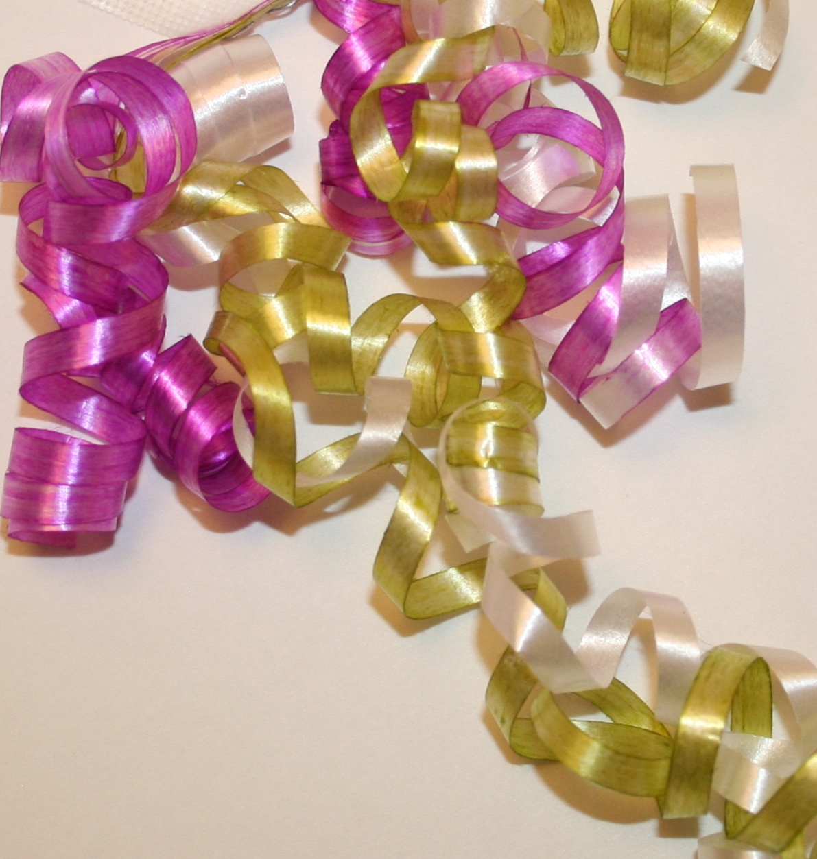
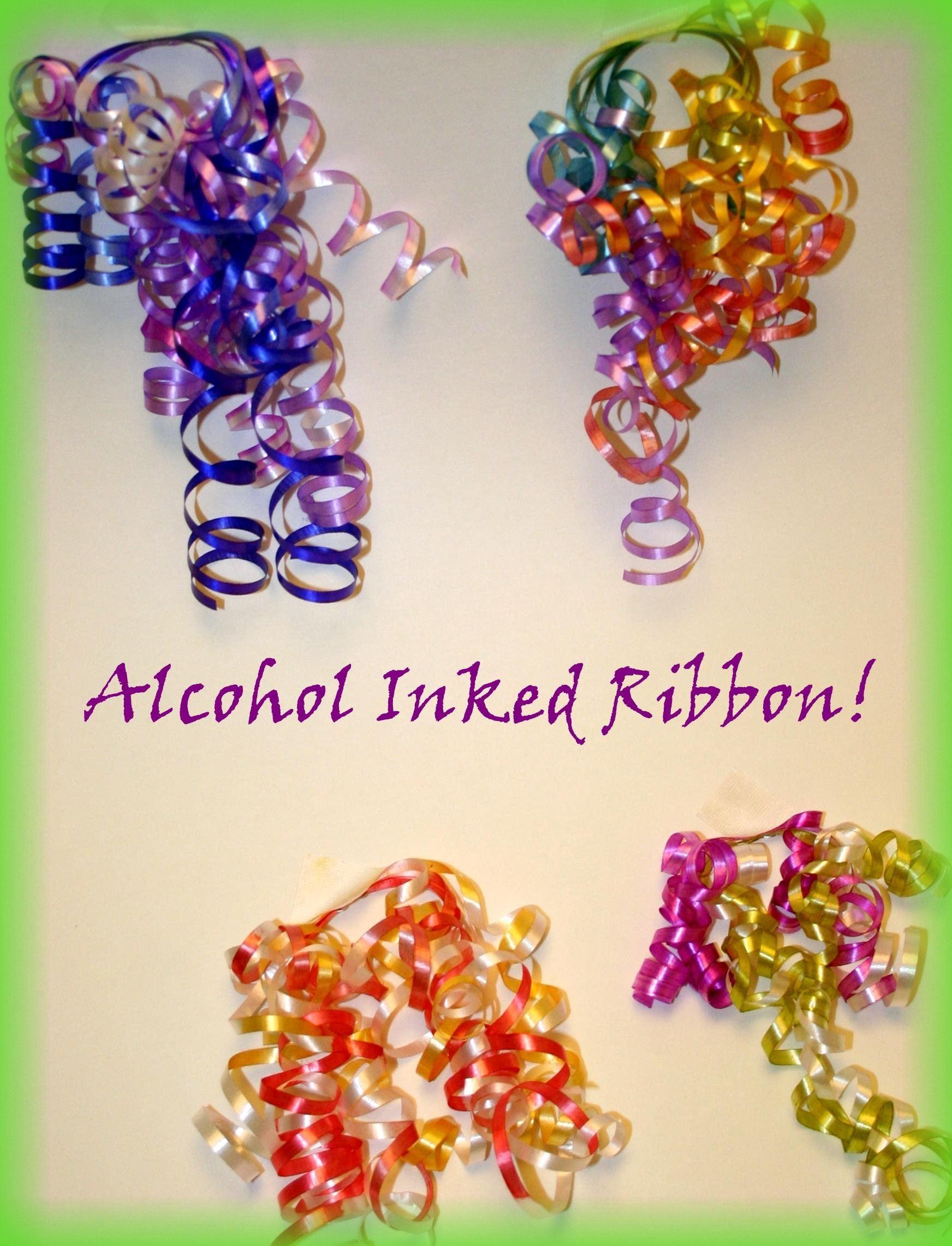
Ribbon dyed using Adirondack Alcohol ink. Colors used are Citrus and Wild Plum.

While putting together a little box of Chocolates for my mom, I realized that the only gift wrap ribbon I had in the house was White, Purple or Christmas colors.  The packaging on the chocolates was a light pink and green.  The purple would clash and the Christmas red or green would just look odd, so I picked up the white ribbon and looked around my craft room.  My eyes fell on my tin of  Alcohol Inks.  Perfect!

The plain white ribbon ended up being a pretty green, pink and white combination.  It was lovely and my Mom liked hearing how I created a matching ribbon cluster.  I know that I will never buy a pack of gift wrap ribbon again now since I can make some pretty cool bows and clusters with unique shades.

I got home after our family celebration for Mother’s Day and once again pulled out my little bottles of liquid magic.  So many colors, ideas, and projects fluttering around in my brain!  Time to play!

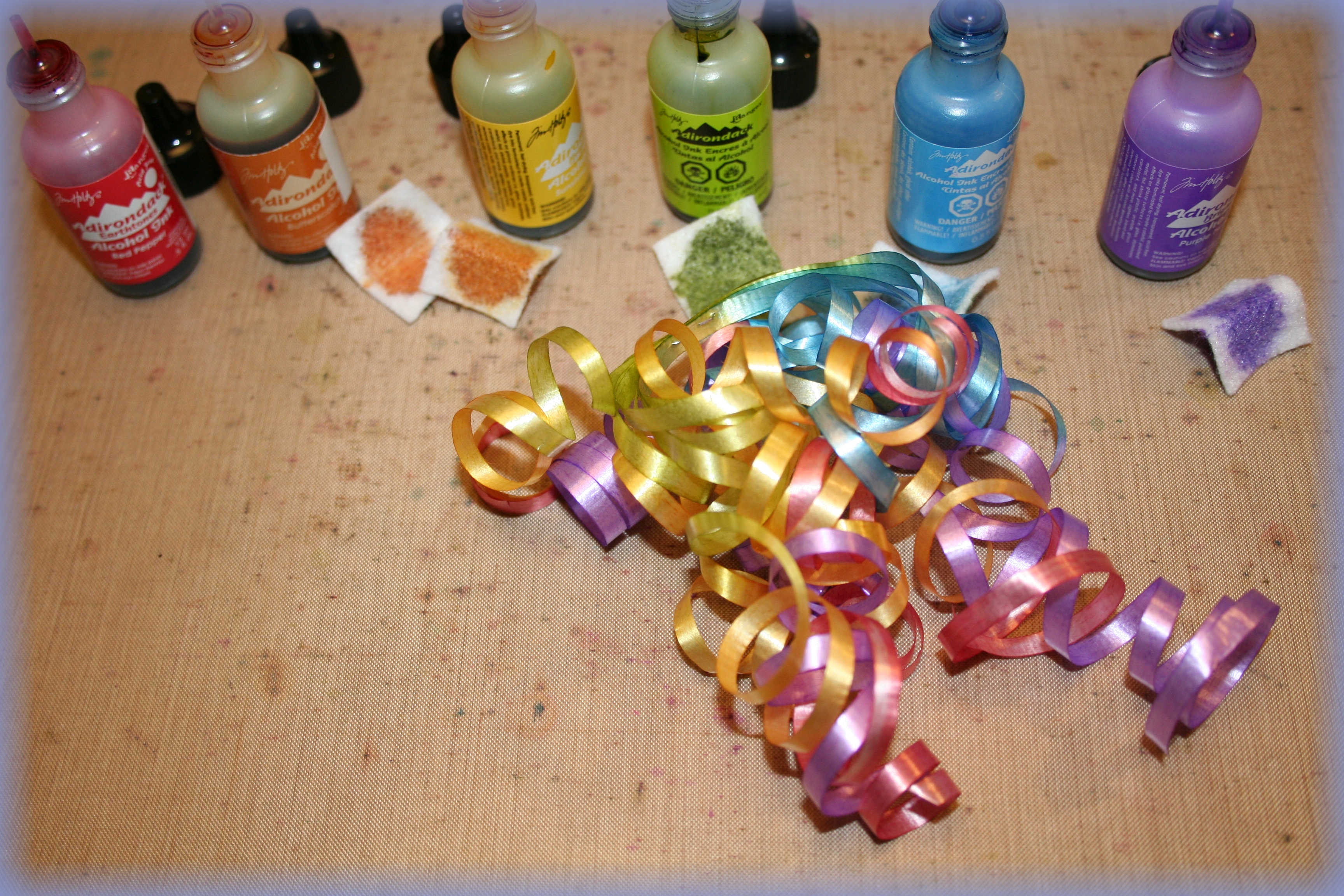
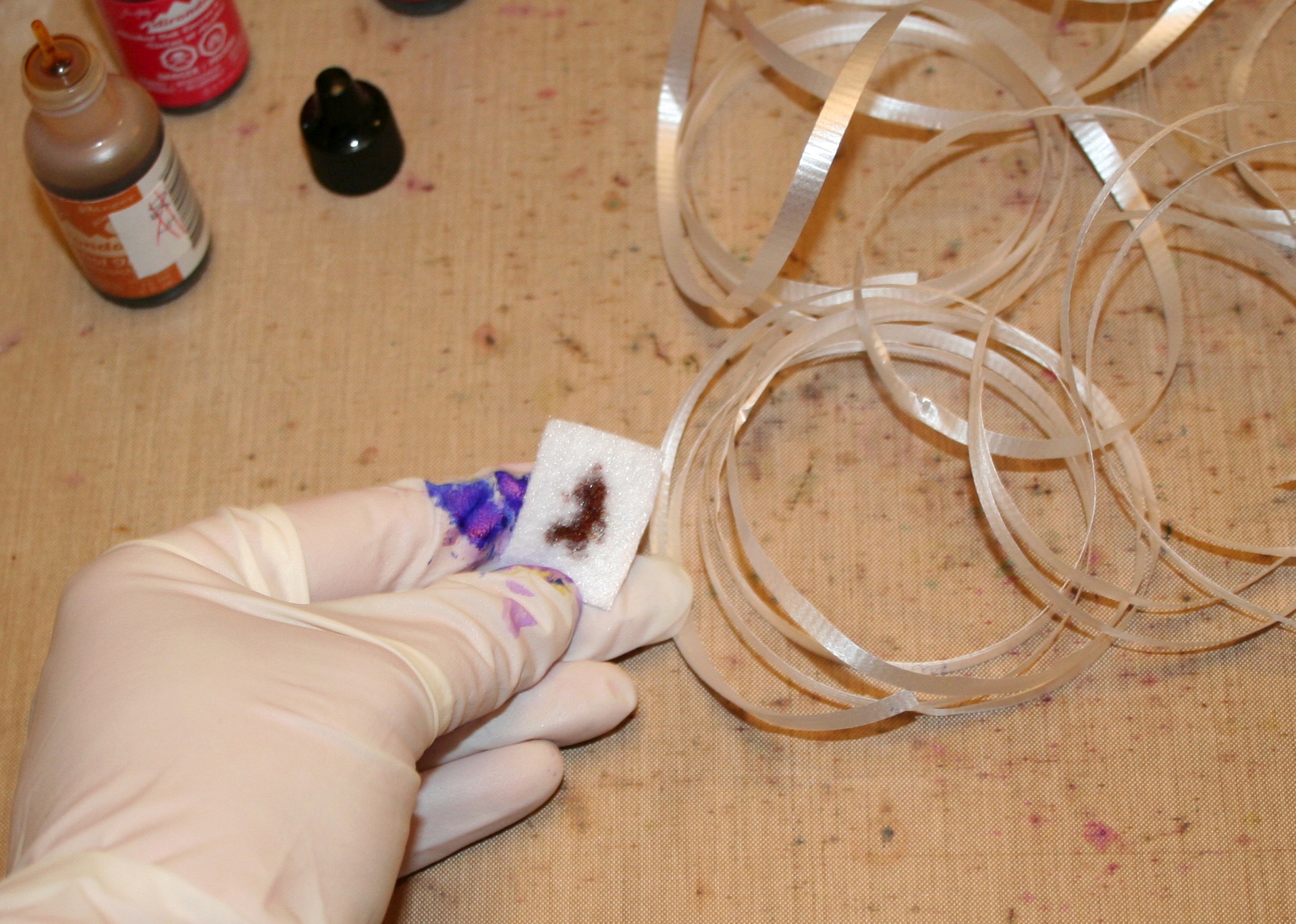
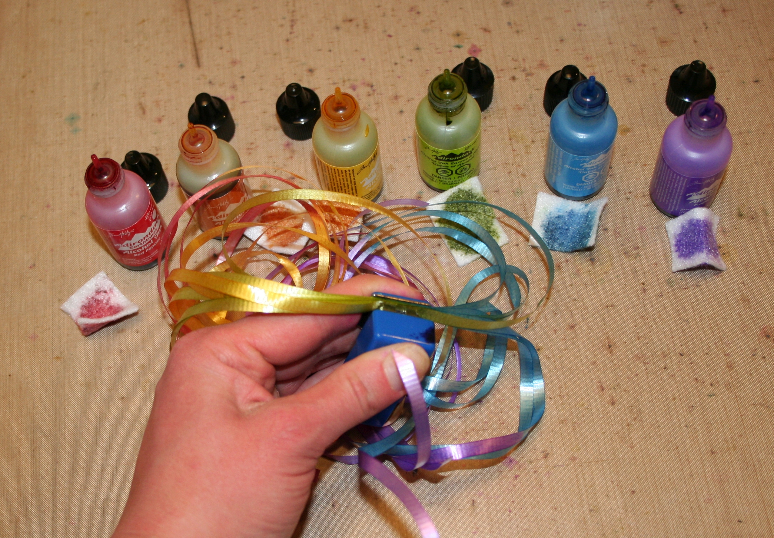
IMG_4764- Blog EditMy process for creating these ribbon clusters is a simple one with few steps.  I started by cutting a selection of various lengths of white ribbon.  It’s inexpensive craft ribbon from the gift wrap section of my local dollar store.  I then selected my Alcohol Ink colors and cut some felt pieces into small squares.

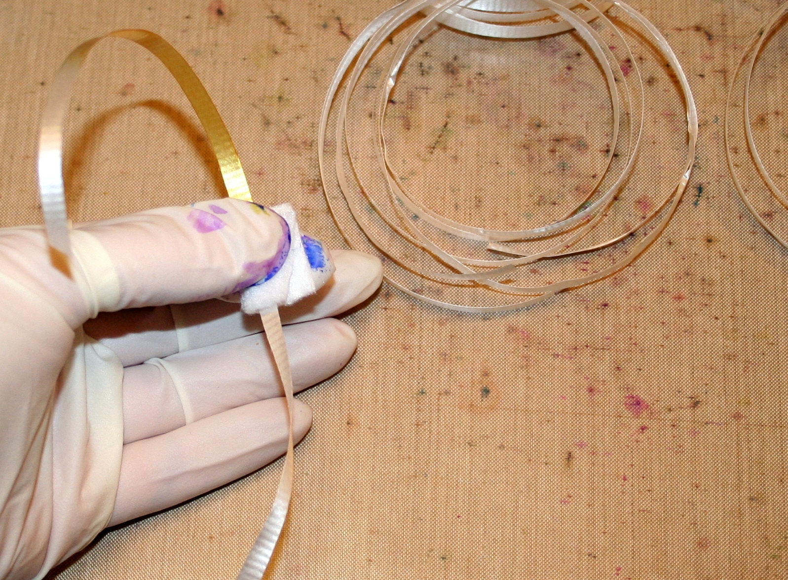
IMG_4765- Blog EditWearing rubber gloves to protect my fingers from looking like I squeezed a rainbow, I held the felt piece between my thumb and forefinger and added a couple drops of the ink.  I then placed the ribbon on the felt and folded the felt over.  Holding a firm, but steady, grip I pulled the length of ribbon through.  Repeat all the lengths of ribbon.

I would like to note here that you really do not need a lot of this ink.  It goes a very long way.  I was able to color a couple pieces of ribbon with only a drop or two.

IMG_4780- Blog Edit
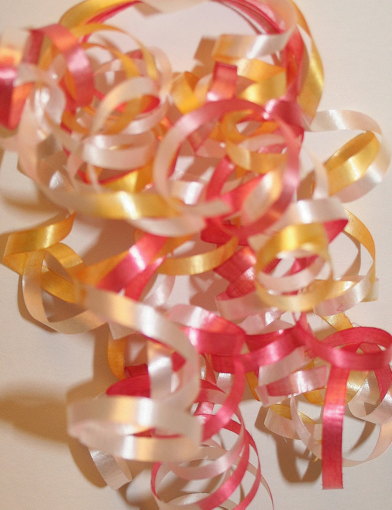
Ribbon dyed using Alcohol Ink colors Watermelon, Red Pepper, Butterscotch, and Sunshine Yellow

One of the most fun parts of playing with this technique is the ability to change it up.  For example you can hold the ribbon to the edge of the ink to only color one side of the ribbon.  You could also get a really neat chunky look if you hold the ribbon in the felt for a few inches of length then remove the ribbon for a few inches.  This would look neat with two different colors on one piece of ribbon!

There are endless possibilities for color combinations.  Ranger’s Adirondack Alcohol Inks come in SO many colors.  A great place to check out all the colors is the Ranger Ink Website.

If you are local to the Calgary Area, or in Alberta, we have a great store here in Calgary that stocks Alcohol Inks.  The Scrap Yard is an incredible store that has an awesome selection.   This store is run by some lovely ladies that have a passion for the craft.  If any of you Canadians are thinking of ordering online from some of the wonderful American stores, be aware of Customs and the time it takes to process the packages.  I have found it to be a slow process, though my order with Alcohol Inks did arrive.

Ok, We’re a bit off topic!  Back to the process of making these ribbon clusters…

IMG_4773- Blog Edit

Once the ribbon is the color I wanted, I stacked the ribbon one on top of the other and held it steady on the edges.  I stapled the center of the ribbon.  To get that bouncy curl, I used the tried and true method of running each of the ribbon pieces along the edge of a blade from a pair of scissors (being careful to not cut myself, of course!).  To clean up afterward was easy.  The felt pieces went into the trash and I used a wee bit of hand sanitizer to clean up the ink on my craft mat and scissors.  Since the inks react to alcohol, hand sanitizer is a great, cost effective cleaning solution.

Another fun detail you can add if you like is to color the staples.  You can use the same ink to color the staples that you used to color the ribbons.   Aren’t these inks the best thing ever?!

With so many options, I found myself trying a rainbow effect.  I do believe it is my favorite, but I know there will be lots more made!

IMG_4783- Blog Edit

What kind of Alcohol Ink techniques are you in love with?  Feel free to leave a comment here on the blog or on the Loving Expressions Facebook page!  We’d love to hear from you.


Materials Used:

  • Ranger Adirondack Alcohol Ink (Colors include Cirtus, Wild Plum, Sailboat Blue, Indigo, Purple Twilight, Watermelon, Red Pepper, Butterscotch and Sunshine Yellow)
  • White Plastic Gift Wrap Ribbon
  • Rubber Gloves (found at my local pharmacy)
  • Stapler
  • Scissors

Birthday Cards for Men

IMG_4486- blog edit

Hi everyone,

So, I was asked to make a card for my husband’s grandfather’s birthday.

Normally when I am asked to make a card, ideas come flooding in.  Every time I am asked to make a card for this particular man, I lose all inspiration.  It’s not because I don’t have any creative drive or little affection for the man… quite the opposite.  I tend to struggle with cards for men, and this is a rather special recipient.  This is one of those times when I want to create perfection.

After some deep thinking, I came up with this card.  It was remarkably easy once I worked out the idea, and I thought maybe it would be a good one to share for those times when inspiration eludes us.

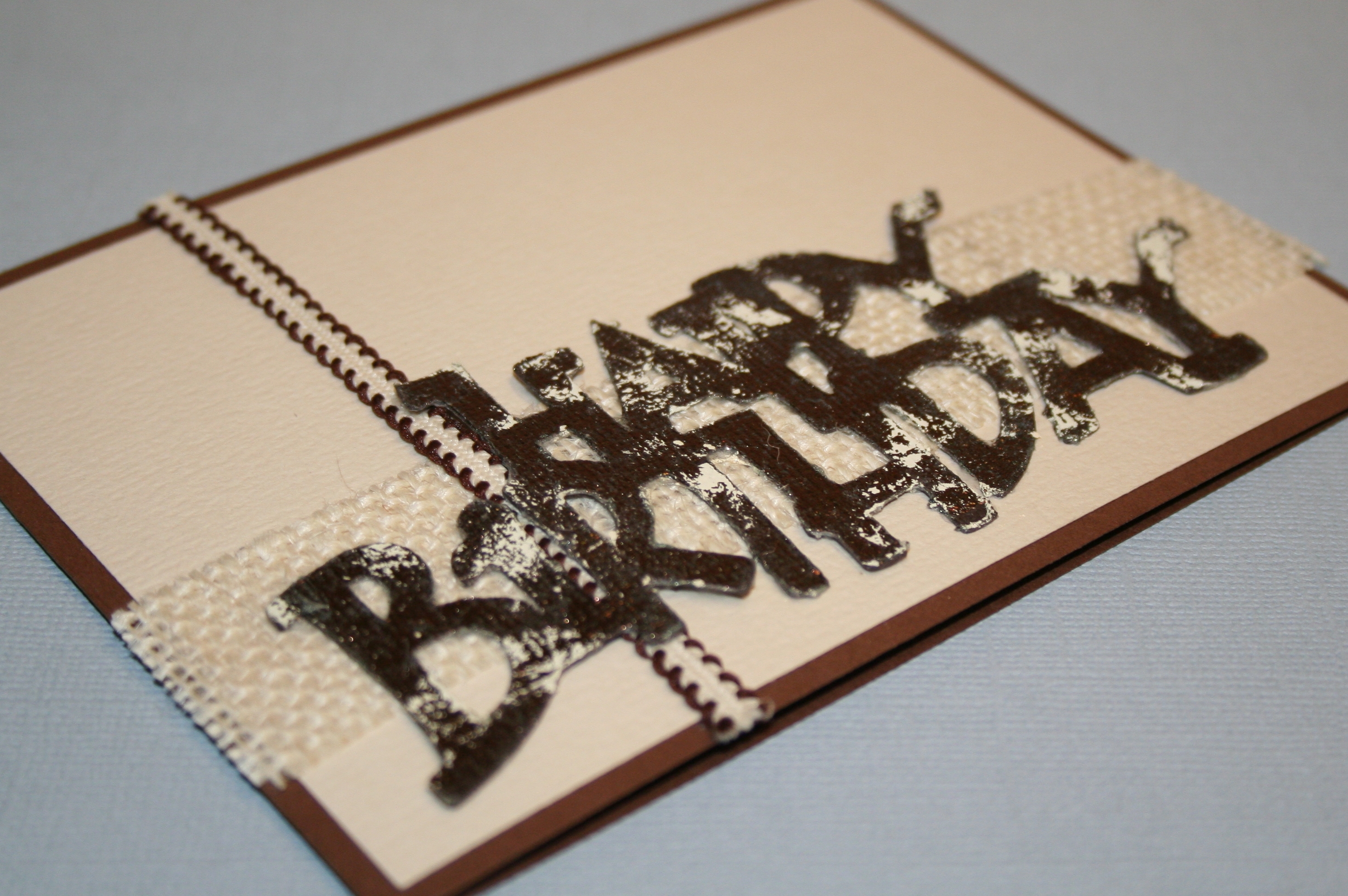
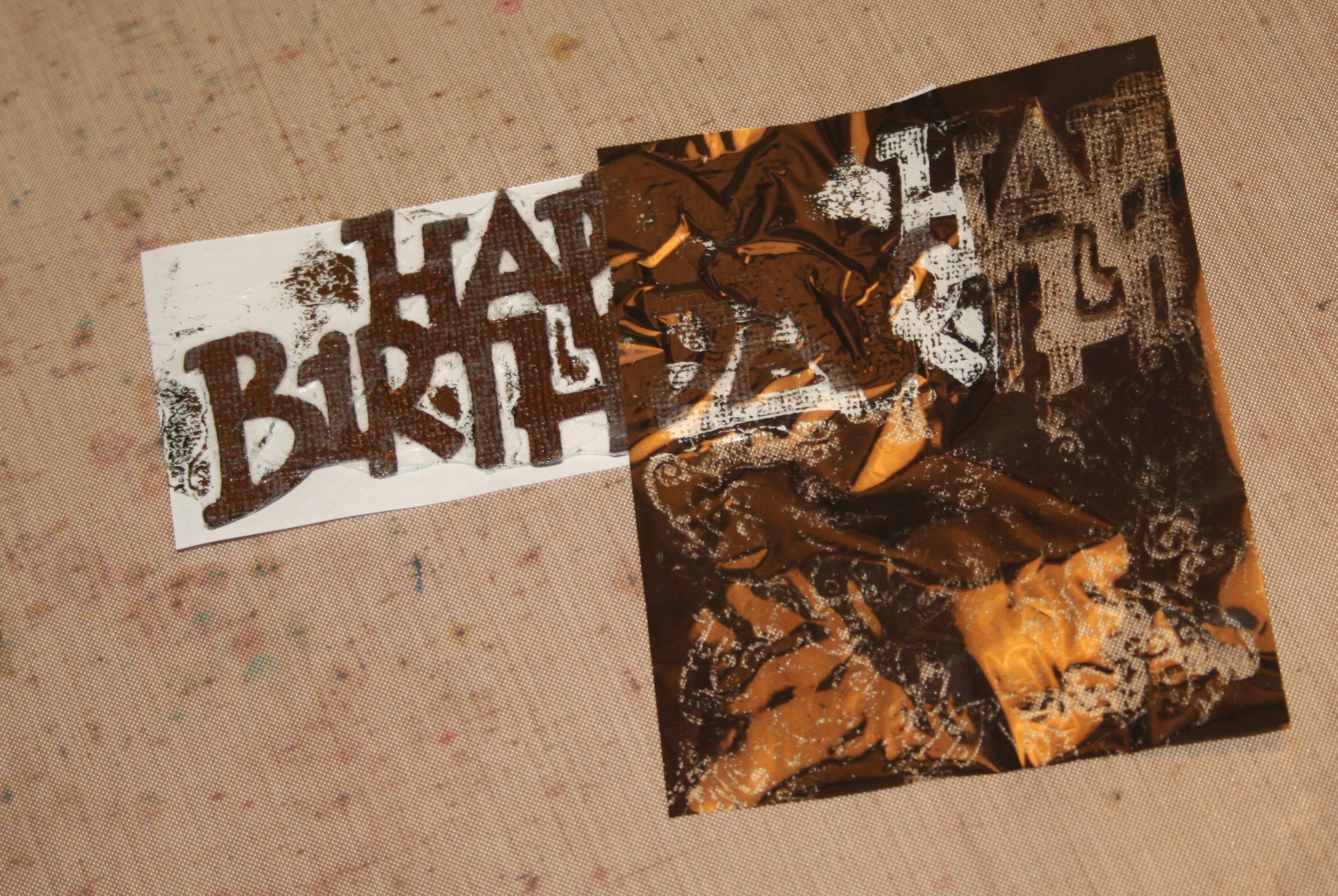
IMG_4458- blog editWhat you will need for this is cardstock, sticky stuff, some Ranger Foil Sheets and a die cutting machine.  I still love my (very old) Cricut so I pulled her out with the Beyond Birthdays cartridge to get started.  I selected the ‘Happy Birthday’ image on the shadow setting and cut it at 2 inch.

IMG_4463- blog editAfter removing my die cut from the mat, I fed it through my Xyron Create-A-Sticker machine.  Since I wanted it sticky on both sides, I flipped it over and fed it through a second time.  To help the image go through again, I trimmed down the backing piece before feeding it through.

I pulled off the backing covering the top side of the image.  While this will create a layer of glue in the negative space, that’s ok.  It can be easily removed later.

IMG_4467-blog editThe Ranger Foil Sheets are super easy to use.  All I needed to do was press the ‘ugly’ side down (all you need is a light pressure with your fingers) on an adhesive and gently peel it off.  If you would like a distressed look like I did here, just choose a different color foil and go over the blank areas.  Press, gently remove, repeat until you have the look you like!

IMG_4479- blog editOnce my ‘Happy Birthday’ piece had that pretty distressed foil look, I chose a card blank I had previously made using Bazzill brown Cardstock.  I chose a second piece of Bazzill cardstock in cream for the layering.  The notecard measured 5.5 inch x 4.25 inch.  I cut the cream piece approximately 5.25 inch x 4 inch and attached it using double sided tape.  I cut a piece of Recollections burlap to a 1 inch width and glued it down using Ranger Multi Medium Matte.  Wanting a bit more dimension I chose a piece of Recollections ribbon and stuck it on using the same glue.

IMG_4482- blog editBefore attaching the ‘Happy Birthday’ die cut, I removed the backing to reveal the glue.  There was a fair amount of glue in the negative space so using a pair of tweezers, I gently pulled the excess toward the back of the die cut.  I removed the pieces that detached easily and folded over the pieces that remained attached.

To ensure the card survived the mail all the way to Australia, I added a few drops of the Ranger Multi Medium to the back of the die cut and attached it to the card.

IMG_4483- blog editTo finish it all off, I went over the image one more time with a foil sheet to cover all the sticky bits.  This gave it more of a polished look and made sure there was no areas of adhesive left uncovered.  I then gently cut off the ends of the ribbon and burlap so that they were flush with the card.

While it’s not quite the perfection I want (there is ALWAYS room for learning and improvement) I am really pleased with the result and am sure he will like it!

IMG_4500- blog edit

I know we all have those tough projects we take on.  What themes do you struggle with the most?  What are your fall back techniques?  Leave a comment and let us know!


Materials used:

  • Cricut cutter with Beyond Birthdays cartridge
  • Bazzill Basics Cardstock
  • Xyron Create-A-Sticker 2.5 inch machine
  • Ranger Foil Sheets (Vintage)
  • Ranger Mulit Medium Matte
  • Recollections Burlap
  • Recollections Ribbon
  • Quilled Creations Quilling Tweezers
  • Double Sided Tape

Card and Envelope Sizes

IMG_4202- Blog

Hello all!

One of the first questions I had when I first started making cards:

How big do I make the card?

After starting out and getting a rhythm with my pen knife and metal ruler, I moved to Scotland. It was then that I learned common envelopes sizes were different in North America and Europe.  I made a card to send back to Canada.  After doing some research on where to shop, I went out and bought a pack of envelopes to find my card was TOO SMALL!!!  Time to learn my cards sizes!

Here in Canada, and in the United States, the most popular handmade card size fits an A2 envelope.  A2 measures, in inches, 5 3/4 by 4 3/8 inches so card sizes are commonly made around 5 1/2 by 4 1/4.   An A4 envelope, measuring 6 1/4 by 4 1/4 inch,  in North America is closer to the C6 envelope, which is the size you will commonly see in Europe (and much of the world).  A C6 envelope measures 6 2/5 by 4 1/2 inches.

Other common card and envelope sizes that you will find in craft stores include A6 (6 1/2 by 4 3/4), A7 (7 1/4 x 5 1/4), or square that are usually around 6 by 6 inch.

Personally, I tend to stick to A2 envelopes for greeting cards and A4 or A7 for wedding invitations.  The A4 envelope works well when doing more detailed cards such as a tri-fold shutter card.

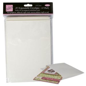
For those of you that love to have lots of dimension in your cards, Anita’s Expandable Envelopes by Docrafts are the best for those multimedia cards or those with lots of layers of foam tape.  They’re a must-have in my supplies, and come in a variety of sizes!

These can now be found on Amazon.ca, but the image below will take you directly to the Docrafts website.

ANT 1704001-xlarge

Which card size do you use the most?  Leave a comment and let us know what works best for you!

Quick and Easy Watercolor Cards

IMG_4324- Blog Edit

Hi Everyone,

Watercolor is a very pretty way to add some really neat color to any stamped image.  While there are lots of ways to achieve some cool results, sometimes we just want something quick and easy.  Watercolor pencils are great tools to get that fast, yet beautiful, project done.

IMG_4295- Blog EditTo start this card I chose a favorite stamp from the Inkadinkado Vintage Flowers set.  I stamped it using Ranger Archival Ink (Black), on a piece of Canson Watercolor Paper, and gave it a quick blast with my heat tool to make sure it was good and dry.  When using watercolor, make sure you’re using a permanent and waterproof ink to keep the image crisp and clear when you’re putting the water on.

I selected a few cheerful colors and started lightly coloring in the image.  There’s no need to worry about getting everything filled in perfectly since that’s where the water does all the work.  I simply added some pencil color to the areas I wanted.  For this project I wanted to give the petals yellow tips, so I colored the bases of the petals pink about a third of the way up then added yellow on the tips so when I add the water (starting at the base of the petal and working out) the pink and yellow will blend toward the tips of the petals.

IMG_4297- Blog EditIMG_4303- Blog CopyOnce I had some color down, it was time to pick up my trusty water brush and start the blending magic.  The water brush I am using is the Tim Holtz Detailer Water Brush.  It is perfect for letting out just the right amount of water for an easy blend, and if I find the water flow is a bit too much, I will gently blot if off with a dry bit of a cloth and continue on.

After blending out the pencil, I decided that I wanted to add a bit more pink to the petals.  Rather than drawing the watercolor pencil onto wet paper (which will result in a very bold splotch of color from the pencil) I picked up some color directly onto the brush from the pencil and mixed it with water onto my craft mat.  I then applied the color from the craft mat to where I wanted to blend it in.  If you don’t use a craft mat on your work surface you can easily mix the color with water onto an acrylic stamp block which is easy to wash off and creates a handy mini palette for you to work with.

IMG_4310- Blog Edit

Once the image was blended and I was happy with it, I trimmed the piece of paper with my image and decided I wanted to add a very light distress edge with the pink watercolor.  To achieve this light edge, I again picked up color off the pencil directly made a puddle of pink water on the craft mat.  I dragged the edge of the paper through the puddle and used my finger to blend it into the paper.  If you find the results are too light, you can let it dry (or give it a quick blast with a heat tool) and repeat the process to layer the color onto the edges.  Once I had the edges all pink, I dried it with my heat tool and gave the edges one final inspection to make sure it was just the way I wanted.

Yay, the watercolor image is done!  Time to build my card.

IMG_4314- Blog EditTo add some dimension around my stamped image I trimmed a piece of scrap pink cardstock from my scraps box and a piece of vellum to layer behind the image. I put it all together using double sided tape then added a piece of fun foam to the back to raise the image up off the card.  Using a notecard I made with Bazzill Basics Lace cardstock, I trimmed down a piece of Colorbok Ombre paper to use as a background and attached it to the cardstock using double sided tape.  I applied more of that trusty double sided tape to the fun foam and stuck the image to my card.
Last step was for some embellishments.  Since the image is so bright and cheerful, I chose a smaller collection of embellishments- few rhinestones and a bow- to finish off the whole project.  The Ranger Glossy Accents had that bow attached in no time and my card is done!

IMG_4323- Blog Edit

Once again, a little bit of watercolor makes another beautiful image!  Do you love watercolor too?  Leave a comment and let us know what your favorite watercolor products are!


Materials used:

  • Ranger Archival Ink
  • Tim Holtz Detailer Water brush
  • Inkadinkado Vintage Flowers Stamp
  • Staedtler Watercolor Pencils
  • Canson Watercolor Paper
  • Celebration Ribbon
  • Recollections Adhesive Rhinestones
  • Fun Foam
  • Bazzill Basics Cardstock
  • Colorbok Ombre Paper
  • Ranger Glossy Accents
  • Ranger Heat Tool

Tool Tips – Adhesives

Hello!

IMG_4234- Blog

Sticky stuff is in abundance here in my craft area!  Gone are the days of a glue stick and hot glue gun doing the most work for our craft projects.  There are matt and glossy finishes, quick dry, permanent and repositionable, spray glues, sticker making machines, and so on.

So which do I find the most helpful?

There are a few things that I look for when choosing adhesives.  I look for fast dry, non-warping options.  I find my number one, go-to adhesive is double sided tape.  While I do have a variety of sizes, but I tend to stick to basic acid free double sided tape.  Foam tapes are also a huge part of my adhesives drawer as they are so convenient for adding some quick and easy dimension to any project.

For gluing paper. in my opinion the ultimate tool is the 2 Way Glue by Zig Memory System.  This fabulous product goes on blue to help you see where it’s applied, dries clear and does not warp cardstock.  A little bit of this goes a long way for a good permanent stick BUT if you stick pieces together after it goes clear, it’s a great temporary adhesive.

Another must have in my supplies is the Ranger Glossy Accents.  This amazing product can do SO many things such as adding a touch of glossy embellishments, adding dimension to embellishments or sticking stuff down to your project.  The best part, it’s completely clear so when used to adhere acetate, or acrylic pieces, you can attach it without having the glue show through.  It’s also rather quick drying so you’re not having to wait too long to have your project complete.

Lastly, a favorite of mine is my Xyron Create A Sticker Machine.  I LOVE being able to feed through a cutout and have a sticker that’s ready to stick onto any card, scrapbook layout or even notes to the husband.   When doing a project that involves many little pieces (such as a tri fold shutter card) I find the convenience of easily having all the pieces on a sticker strip to be so helpful.

So what methods of making your projects stick do you prefer?  What are your favorites?